Really Simple Guide to Responsive Web Design
Website design for the modern digital world we live inCreating websites for the plethora of devices in use today requires a significantly different way of thinking which is often easily missed by those not working in this industry day in day out. This guide is designed to put things into perspective with responsive web design to understand what this means for your business.
The Modern Digital World
We live in a digital world with an enormous amount of devices customers use. This presents a huge challenge for the design and layout of your website which has to cater for all of the different devices, screen sizes and resolutions that are in use today.

Putting this into context with real data, you can see just how many different screen sizes people actually use with the below data being just a small sample of the thousands of devices people are using today;
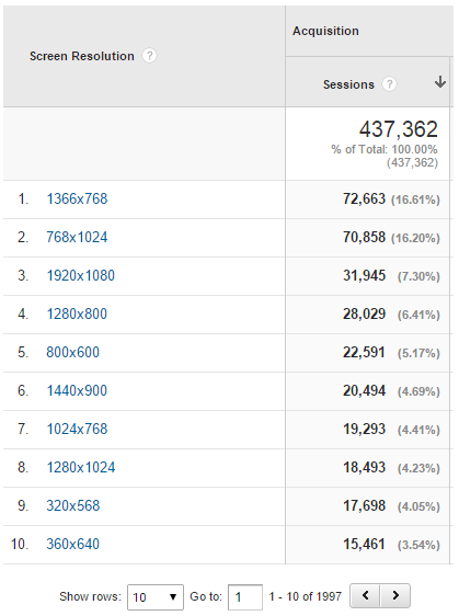
What this means for your website design is that quite simply, trying to cater for everyone is a near impossible thing to do! Most importantly though, what you are seeing on your computer right now is likely not what the average customer is seeing which means that you may in fact be in the minority of users depending on the technology you are using. Always check your own data within Google Analytics to understand what technologies your customers are using on your website. Understanding this data will allow you to make an informed decision about how to proceed.
Understanding Responsive Web Design
So now we have a bit of context about just how complex the modern digital world actually is, let’s take a look at what exactly responsive web design is and why this is the only method for the majority of businesses to use.
Responsive web design is not designed to show different content on different devices. That is a development method known as adaptive web design. There is a key difference here which is important to understand. To understand this, it is important to understand a bit of the technology behind how websites work.
Your website is made up of many languages in the background which broadly fall into two categories, server side languages and client side languages. The difference being is that server side languages do all of their processing and calculations on the web server whereas client side languages do all of their processing and calculations on the client side, i.e. your computer when you are accessing a website. Generally speaking, client side languages look after the pretty parts of the website that you see and interact with, whereas server side languages look after the heavy lifting and shifting such as storing your data and doing more data intensive tasks.
For responsive web design, what this means is that when you request content from the web server, you are always going to receive the same content back no matter what. The reason for this is because your web server is not serving you content based on the device you are using. Instead, all of the content is being delivered to you which is then simply being re-organised on your screen once you receive the content based on the device you are using.
When comparing this to adaptive web design there is quite a difference. With adaptive web design it is possible to change the content that is delivered to the user based on the device they are using to access the website. This means that the server has to understand what device the user is using along with what functionality this device is capable of. For example, some smartphones may have a camera on the front whereas others may not. Likewise, some smartphones may have GPS enabled whereas others may not have this sensor built into the phone. Then for non-smartphones, you cannot expect to see all phones with GPS which means that your functionality must work for phones without the latest technology. Adaptive web design requires a lot more investment as there are additional technologies required and lookup functionality on the server side which adds cost to any project.
Responsive Grids
The basis of responsive web design comes down to responsive grids. Simply put, this means that a grid layout made up of rows and columns will automatically stack the content to fit on the user’s device in an effective way. The way the content is stacked is by row then by column. So for example, for row 1, column 1, 2, and 3 would first stack beneath each other before row 2 is adjusted accordingly. This significantly alters how you build a responsive website to ensure that the website continues to work across all devices as you cannot guarantee that column 3 is going to be on the same line as column 2, as on certain devices this may in fact be stacked beneath on a second row unless this is imperative that this row doesn’t stack and in which case this could make the buttons small and hard to click on smaller screen sizes.
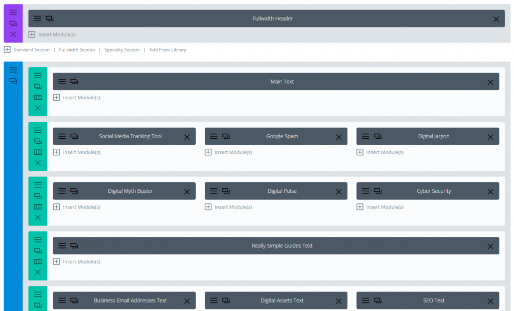
For example, when you view our resources page, this looks well across all devices. The reason for this is because there is a well-structured responsive grid in the background powering this layout which can be easily adjusted as needed. Below is the administration interface behind this responsive grid on this specific page;
Sounds simple in theory, right? Well, yes, it is in theory. The practicalities of this are somewhat a little more challenging based on the technology you are using on your website and the level of control you require.
The Challenges
There are many different challenges with responsive web design, all of which are compromises one way or another depending on your individual needs as a business.
White Space is Your Friend
Traditionally when building websites, you would look at the layout on a desktop or laptop computer and look around for what items could fill various white spaces. Taking this approach simply doesn’t work for modern web design. White space is your friend. What you are personally seeing on your own computer is unlikely to be what the majority of other users are seeing on their websites.
For this reason, wanting to nudge an element to the left, right, up or down a few pixels is often a never ending task when remembering the enormous amount of devices and screen sizes people are using to access websites. Unless there is an unlimited budget for the never ending task of continuous improvements for minor layout differences on different devices, then instead the focus needs to be around simplicity, allowing changes to work across as many devices as possible which ultimately means you need to become comfortable with white space and not looking to fill every aspect of space on the screen with clutter. Simplicity is key to making responsive web design work effectively.
WordPress Frameworks
This brings us onto the next challenge which is technology related. Specifically looking at WordPress, there are tens of thousands of WordPress themes available, so which one should you choose? Well, the choice is actually quite simple when you know what to look for as the choice isn’t about the look and feel of the theme, instead the choice comes down to using a reputable theme which is capable of customising as you need. We’ve already covered details about why your WordPress website is probably struggling to cope with your needs, so we would recommend reading through this to understand why there are only a small number of choices related to your theme.
Your WordPress theme that is used determines how good or bad your responsive website will be. You cannot simply take a non-responsive framework and make it responsive without an enormous amount of work which is a non-starter and something that you would simply never do. Your WordPress theme also determines how much or how little content you can actually change on the website yourself.
WordPress is designed to allow users to edit website content their self, which means that it is important not to build a website on such a great open source platform and take away this key functionality. It’s kind of missing the whole point by doing this. What this means is that this is again another choice to be made, do you want something that is truly amazing from a development standards point of view, which would require you to keep paying a web developer to make even minor changes to content on your website and requires a much larger budget to get off the ground due to the additional work involved, or would you prefer to use a system which puts you in control and use a leading WordPress responsive theme which already takes care of many of the user elements to allow you to customise the website as a user yourself once the website is built? The decision is often a financial decision since the levels of investment in these different options is significant to say the least.
WordPress is great, but it is not perfect. Not by a long shot. What this means is that compromises need to be made throughout any web development project, for decisions which either are going to work towards your goals as a business or move further away from them. Once you start down a specific route, there is no magic shortcut should you change your mind half way through, towards the end or even after the project has finished. There is no magic Google Translate button for website technologies that cater for the indecisiveness of human beings.
Responsive frameworks are designed purely for the front end of your WordPress website, the visual side of things. The problem being is that all WordPress themes are a big jumble of mess with PHP code and front end CSS responsive grid code being intertwined into a giant bowl of WordPress spaghetti. This makes things extremely challenging to configure unless you are using a very minimalist framework which as mentioned previously, comes with higher budgets and less options for you to customise the website yourself. Again, decisions to be made.
Platform Independent Responsive Frameworks
Looking at custom built solutions, it is possible to be much more creative as you are not restricted by things such as the way a WordPress theme has been built and the level of customisations that are possible. What this means though is that when you start looking at this level of flexibility, then you are starting to enter into the mid-range for 5 figure budgets. The level of investments that are only possible for much larger businesses. Unfortunately, it is not possible to have the same levels of functionality and usability as large brands without the budgets and teams of full time web developers dedicated to the project.
When you do start to look at this level of investment though, one of the leading responsive frameworks is Bootstrap. Bootstrap is the most popular HTML, CSS and JavaScript framework for developing responsive, mobile first projects on the web. Bootstrap is awesome to work with as this gives you full control of everything you could imagine on the front end of your website as a website developer which is great. The challenge being though is that as a user this makes things difficult for you to change which again has on-going financial commitments for basic improvements.
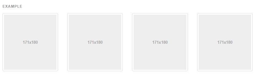
For example, below shows the Bootstrap grid which you will notice actually looks very similar to the grid mentioned previously, although the underlying technology is vastly different.

Desktop Usability Doesn’t Work on Mobiles
Remember that when designing for mobile first there are many pieces of functionality that simply do not work on mobile devices, primarily on-hover functionality, right click functionality and more. Wanting to optimise your website towards a user base that is ever decreasing is again something to be aware of that it is better to be focusing on functionality that applies to every user, not just a sub-set of users unless you have an unlimited budget. This brings us onto the summary for responsive design, which is mobile first.
Mobile First
Adopting a mobile first approach for all responsive web design projects is an absolute must. For every feature, functionality and tweak you have to ask yourself the question, how will this look, feel and work on a mobile device? If you cannot answer this question well, then it is likely that this item you want adding in is clutter and is designed to fill white space on a desktop screen. Remember, simplicity is key with responsive web design as everything has to work on a mobile device.
In summary, responsive web design is a new way of thinking about your website. It is essential to look beyond your own personal screen when you are looking at the website and understand this in a wider context. The reality is that you are not going to be seeing the same layout as everyone else due to the enormous differences in screen sizes. Look at the data within Google Analytics and use this to plan improvements in a structured way.